dumbbellplot
dumbbellplot creates a dumbbell chart comparing two sets of values
Description
A dumbbell plot is a data visualization used to compare two values per category. Each category is represented by two points connected by a line, resembling a dumbbell. The two points usually indicate before–after, A vs B, or two time periods. The distance between the points highlights the magnitude of change or difference. Colors or shapes can distinguish the two values clearly. It is especially effective when comparing many categories without clutter. Dumbbell plots emphasize direction of change better than bar charts. They work well with ordered categories to show trends. They require a common numeric scale for meaningful comparison.
Overall, dumbbell plots provide a clean and intuitive comparison tool.
Example double vertical plot.ax
=dumbbellplot(X,
Name, Value)
Examples
 Example data for a 10-row dumbbell chart.
Example data for a 10-row dumbbell chart.
categories = "Item " + (1:10)';
beforeVals  = [52; 47; 63; 58; 44; 71; 39; 66; 55; 49];
afterVals   = [61; 50; 68; 62; 48; 78; 45; 70; 60; 54];
T = table(beforeVals, afterVals, ...
'VariableNames', {'Before','After'},'RowNames',categories);
dumbbellplot(T);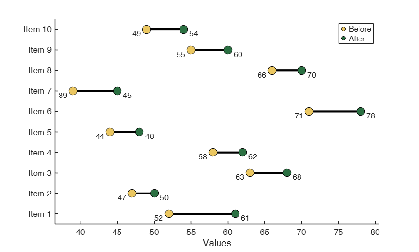
Example double vertical plot.
Example double vertical plot.Patient health metrics: systolic BP comparison across two time periods
patients = {'Patient A', 'Patient B', 'Patient C', 'Patient D'};
% Period 1: January measurements
jan_morning = [120, 135, 128, 142];
jan_evening = [128, 145, 135, 150];
% Period 2: June measurements (after lifestyle changes)
jun_morning = [115, 125, 120, 135];
jun_evening = [122, 132, 128, 142];
figure;
dumbbellplot(jan_morning, jan_evening, jun_morning, jun_evening, ...
'plotType', 'double','orientation', 'vertical','labelX1', 'Morning', ...
'labelX2', 'Evening','Title', {'January BP', 'June BP'},'YLabels', patients);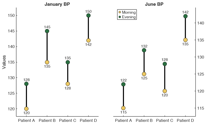
Related Examples
Example of MarkerSize being used to show weights.
Example of MarkerSize being used to show weights.
products = {'Product A', 'Product B', 'Product C', 'Product D', 'Product E'};
before_campaign = [65, 45, 78, 52, 88];
after_campaign = [82, 68, 95, 71, 92];
% Marker sizes based on revenue importance (arbitrary weights)
importance = [300, 200, 150, 90, 450];
figure;
dumbbellplot(before_campaign, after_campaign, ...
'MarkerSize', importance, ...
'labelX1', 'Pre-Campaign', ...
'labelX2', 'Post-Campaign', ...
'Title', 'Marketing Campaign Impact (marker size = revenue weight)', ...
'YLabels', products);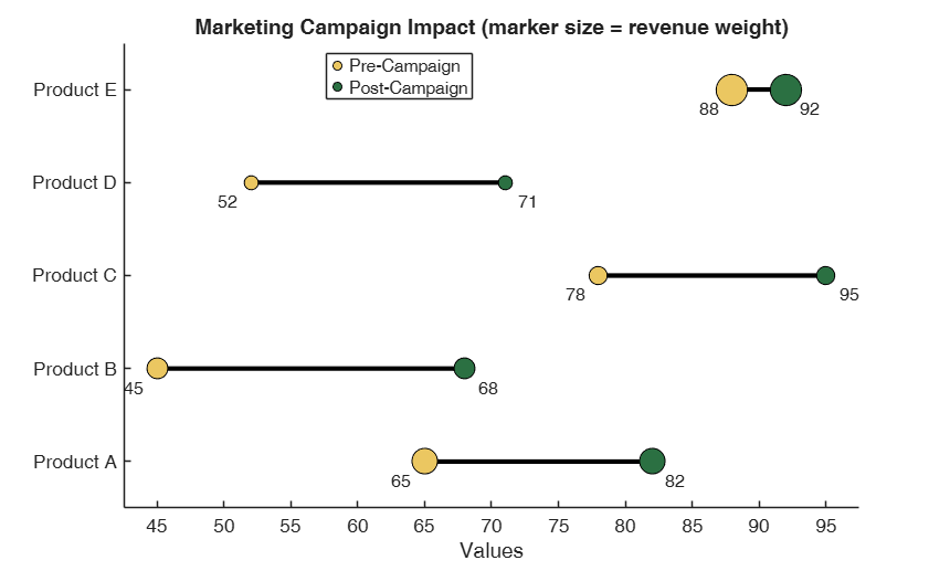
Example of plot with background bands and text inside the dots.
Example of plot with background bands and text inside the dots.
X1 = [45, 62, 38, 71, 55, 48];
X2 = [58, 55, 75, 84, 68, 52];
categories = {'Sales', 'Marketing', 'IT', 'HR', 'Finance', 'Operations'};
figure;
dumbbellplot(X1,X2, "YLabels", categories, "Title", "Horizontal Plot with background bands", ...
"TextInside", true, "labelX1","Q1", "labelX2", "Q2", "Background", "bands");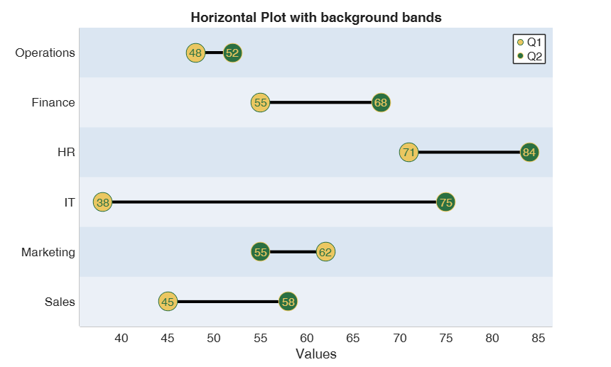
Input Arguments
Output Arguments
References
Cleveland, W. S. (1984). Graphical Methods for Data Presentation, "The American Statistician", Vol. 38, pp. 270–280