funnelchart
funnelchart displays a funnel chart
Description
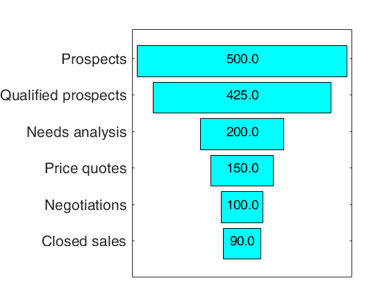
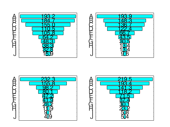
Funnel chart provides a graphic representation of data values across multiple stages in a process. The chart displays progressively decreasing values in proportions amounting to 100 percent in total. For example, you could use a funnel chart to show the number of sales prospects at each stage in a sales pipeline. Typically, the values decrease gradually, allowing the bars to resemble a funnel. This type of chart can also be useful in identifying potential problem areas in an organization’s sales processes. A funnel chart is similar to a stacked percent bar chart. For more details see: https://en.wikipedia.org/wiki/Funnel_chart
funnelchart with Labels option.h
=funnelchart(x,
Name, Value)
Examples
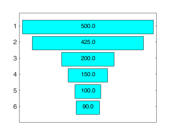
 funnelchart with all default options.


