spmplot
spmplot produces an interactive scatterplot matrix with boxplots or histograms on the main diagonal and possibly robust bivariate contours
Syntax
Description
Call of spmplot with option plo: the TickLabels are formatted.H
=spmplot(Y,
Name, Value)
Examples
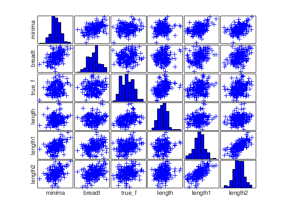
 Call of spmplot with option plo: long Labels are shorten.
Call of spmplot with option plo: long Labels are shorten.
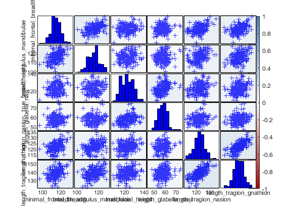
load head;
plo=struct;
plo.TickLabels = [];
plo.nameY      = head.Properties.VariableNames;
plo.nameYlength = 6;
spmplot(head,'plo',plo);
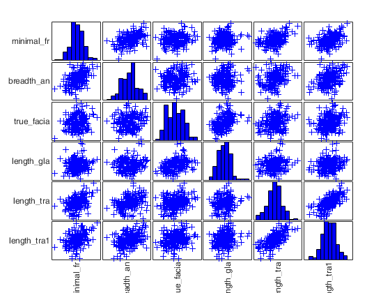
Call of spmplot with option plo: Labels are rotated.
Call of spmplot with option plo: Labels are rotated.
load head;
plo=struct;
plo.TickLabels  = [];
plo.nameY       = head.Properties.VariableNames;
plo.nameYlength = 10;
plo.nameYrot    = 0;
spmplot(head,'plo',plo);
Related Examples
Call of spmplot with name/value pairs.
Call of spmplot with name/value pairs.Specifying overlay, also discarding some groups with the field include, and changing the default colormap.
% The Tag setting will be used in the next example to demonstrate the
% undock option.
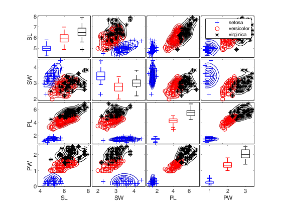
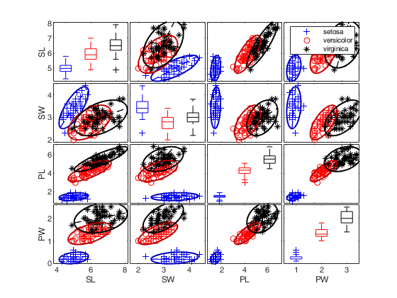
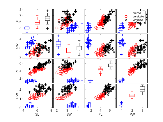
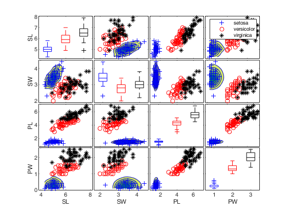
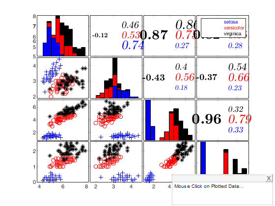
% Iris data: scatter plot matrix with univariate boxplots on the main
% diagonal.
close all
load fisheriris;
plo=struct;
plo.nameY={'SL','SW','PL','PW'};
spmplot(meas,'group',species,'plo',plo,'dispopt','box');
figure
spmplot(meas,'group',species,'plo',plo,'dispopt','box','overlay','ellipse');
figure
spmplot(meas,'group',species,'plo',plo,'dispopt','box','overlay','contour');
figure
spmplot(meas,'group',species,'plo',plo,'dispopt','box','overlay','contourf');
set(gcf,'Tag','newTag')
cascade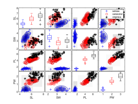
Call of spmplot with name/value pairs and specifying overlay and undock.
Call of spmplot with name/value pairs and specifying overlay and undock.The latter argument requires to change the tag of the scatterplot matrix not to delete.
% This example uses a matrix of logicals to set the undocked panels
load fisheriris;
plo=struct;
plo.nameY={'SL','SW','PL','PW'};
figure
spmplot(meas,'group',species,'plo',plo,'dispopt','hist','undock',logical(eye(size(meas,2))));
cascade
% This example uses a matrix n x 2 to set the undocked panels
close all;
figure
spmplot(meas,'group',species,'plo',plo,'dispopt','box','overlay','boxplotb','undock',[1,3;2,4]);
cascade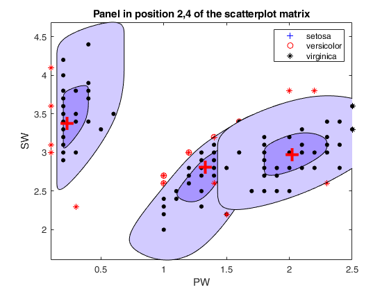
Call of spmplot with name/value pairs and additional options for
overlay, specifying densities just for one group.
Call of spmplot with name/value pairs and additional options for
overlay, specifying densities just for one group.
% Iris data: scatter plot matrix with univariate boxplots on the main
% diagonal.
close all
load fisheriris;
plo=struct;
plo.nameY={'SL','SW','PL','PW'};
over = struct;
over.type = 'contourf';
over.include = logical([1 0 0]);
over.cmap = summer;
figure
spmplot(meas,'group',species,'plo',plo,'dispopt','box','overlay',over);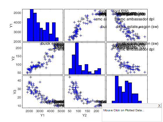
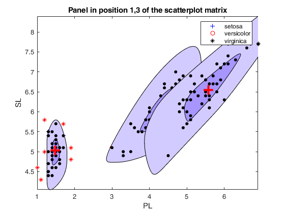
Option datatooltip combined with rownames.
Option datatooltip combined with rownames.Example of use of option datatooltip.
% First input argument is a structure.
close all
load carsmall
x1 = Weight;
x2 = Horsepower;    % Contains NaN data
y = MPG;    % response
Y=[x1 x2 y];
% Remove Nans
boo=~isnan(y);
Y=Y(boo,:);
Model=Model(boo,:);
m0=5;
[fre]=unibiv(Y);
%create an initial subset with the 3 observations with the lowest
%Mahalanobis Distance
fre=sortrows(fre,4);
bs=fre(1:m0,1);
[out]=FSMeda(Y,bs,'plots',0);
% field label (rownames) is added to structure out
% In this case datatooltip will display the rowname and not the default
% string row.
out.label=cellstr(Model);
figure
plo=struct;
plo.labeladd='1';
plo.clr = 'b';
spmplot(out,'datatooltip',1,'plo',plo);
% The units which are already labelled in each panel of the scatter
% plot matrix are those which in the search had a Mahalanobis distance
% greater than 2.5. Note that the labelling is controlled by option selunit.
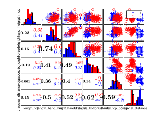
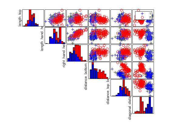
Example of use of option typespm passed as character.
Example of use of option typespm passed as character.if 'typespm','lower' ('upper') just the panels below the main diagonal are shown. In the other part the values of the correlation coefficient are shown
load fisheriris;
spmplot(meas,'group',species,'typespm','lower');
Example of use of option typespm passed as struct.
Example of use of option typespm passed as struct.
load head;
typespm=struct;
typespm.lower='circle';
typespm.upper="number";
spmplot(head,'typespm',typespm);
Example 1 of use of option typespm passed as struct with groups.
Example 1 of use of option typespm passed as struct with groups.
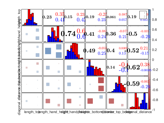
close all
load swiss_banknotes.mat
X=swiss_banknotes;
group=ones(200,1);
group(101:end)=2;
plo = struct;
plo.TickLabels  = [];
% In the lower part the correlations are shown with numbers
typespm=struct;
typespm.lower="number";
typespm.upper="scatter";
spmplot(swiss_banknotes,'plo',plo,'group',group,'typespm',typespm);
Example 2 of use of option typespm passed as struct with groups.
Example 2 of use of option typespm passed as struct with groups.
close all
load swiss_banknotes.mat
X=swiss_banknotes;
group=ones(200,1);
group(101:end)=2;
plo = struct;
plo.TickLabels  = [];
% In the lower part the correlations are shown with squares
% and in the upper part with numbers
typespm=struct;
typespm.lower="square";
typespm.upper="number";
spmplot(swiss_banknotes,'group',group,'plo',plo,'typespm',typespm);
Example 3 of use of option typespm with lower = "none".
Example 3 of use of option typespm with lower = "none".
close all
load swiss_banknotes.mat
X=swiss_banknotes;
group=ones(200,1);
group(101:end)=2;
plo = struct;
plo.TickLabels  = [];
% In the lower part the correlations are shown with numbers
typespm=struct;
typespm.lower="none";
typespm.upper="scatter";
spmplot(swiss_banknotes,'group',group,'plo',plo,'typespm',typespm);

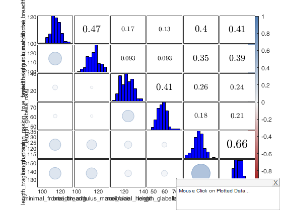
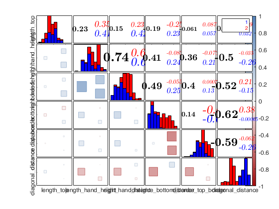
Example of use of option colorBackground.
Example of use of option colorBackground.if 'colorBackground is true the background color of each scatter depends on the value of the correlation coefficient
load head;
spmplot(head,'colorBackground',true);
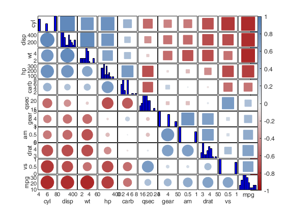
Example 1 of use of option order.
Example 1 of use of option order.The order of the variables is based on the angles between the first two eigenvectors associated to the largest eigenvalues.
load mtcars
typespm=struct;
typespm.lower='circle';
typespm.upper='circle';
spmplot(mtcars,'typespm',typespm,'order','AOE');
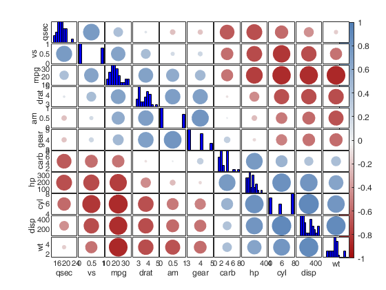
Example 2 of use of option order.
Example 2 of use of option order.The order of the variables is based on the first eigenvector associated to the largest eigenvalue.
load mtcars
typespm=struct;
typespm.lower='circle';
typespm.upper='square';
spmplot(mtcars,'typespm',typespm,'order','FPC');
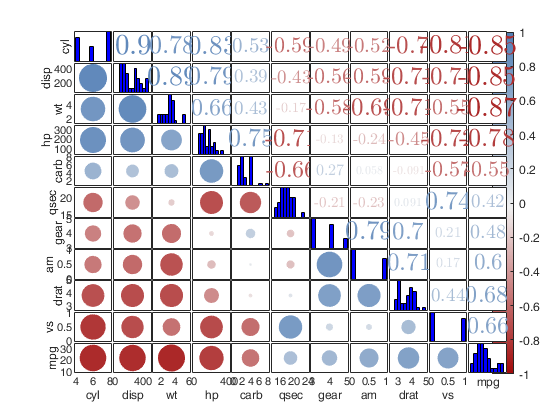
Example of use of option order with cnumber.
Example of use of option order with cnumber.The order of the variables is based on the first eigenvector associated to the largest eigenvalue.
load mtcars
typespm=struct;
typespm.lower='circle';
% Number whose size and color depends on the corresponding rxy
typespm.upper='cnumber';
spmplot(mtcars,'typespm',typespm,'order','FPC');
Input Arguments
Output Arguments
More About
References
Friendly M. (2002), Corrgrams: Exploratory Displays for Correlation Matrices. The American Statistician, v. 56, pp. 316–324, https://doi.org/10.1198/000313002533