waterfallchart

waterfallchart creates a waterfall chart

Syntax

Description

A waterfall chart is a form of data visualization that helps in understanding the cumulative effect of sequentially introduced positive or negative values. These intermediate values can either be time based or category based. The waterfall chart is also known as a flying bricks chart or Mario chart due to the apparent suspension of columns (bricks) in mid-air. Often in finance, it will be referred to as a bridge.

Waterfall chart. For more details see https://en.wikipedia.org/wiki/Waterfall_chart

example

h =waterfallchart(Y) waterfall chart with all default options.

example

h =waterfallchart(Y, Name, Value) waterfall chart with options SetAsTotal and Labels.

Examples

expand all

  • waterfall chart with all default options.
  • X=[245631 -2412 243219 -114899 -18731 -6244 103345 -26745 ...
    -11279 -36000 29321 -4400 24921];
    waterfallchart(X);

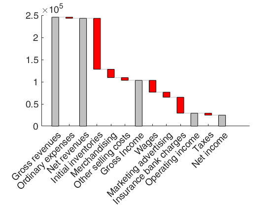
  • waterfall chart with options SetAsTotal and Labels.
  • X=[245631 -2412 243219 -114899 -18731 -6244 103345 -26745 ...
    -11279 -36000 29321 -4400 24921];
    % Define the elements of X which contain the 
    SetAsTotal=[1 3 7 11 13];
    Labels={'Gross revenues' 'Ordinary expenses' ... 
    'Net revenues' 'Initial inventories' 'Merchandising', 'Other selling costs', ...
    'Gross Income' 'Wages' 'Marketing advertising' 'Insurance bank charges' ...
    'Operating income' 'Taxes' 'Net income'};
    waterfallchart(X,'SetAsTotal',SetAsTotal,'Labels',Labels);
    Click here for the graphical output of this example (link to Ro.S.A. website).

    Related Examples

    expand all

  • waterfall chart with options ShowConnectorLines and BarWidth.
  • X=[245631 -2412 243219 -114899 -18731 -6244 103345 -26745 ...
    -11279 -36000 29321 -4400 24921];
    % Define the elements of X which contain the 
    SetAsTotal=[1 3 7 11 13];
    Labels={'Gross revenues' 'Ordinary expenses' ... 
    'Net revenues' 'Initial inventories' 'Merchandising', 'Other selling costs', ...
    'Gross Income' 'Wages' 'Marketing advertising' 'Insurance bank charges' ...
    'Operating income' 'Taxes' 'Net income'};
    BarWidth=0.8;
    waterfallchart(X,'SetAsTotal',SetAsTotal,'Labels',Labels,'ShowConnectorLines',false,'BarWidth',BarWidth);

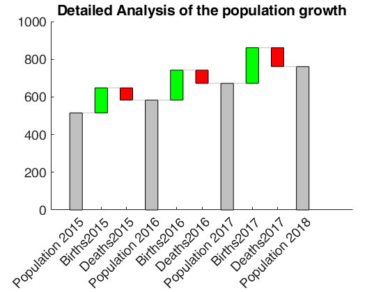
  • waterfall chart with input as a table.
  • figure
    X=[515 133 -65 583 159 -70 672 189 -100 761]';
    rownam={'Population 2015' 'Births2015' 'Deaths2015' ...
    'Population 2016' 'Births2016' 'Deaths2016' ...
    'Population 2017' 'Births2017' 'Deaths2017' ...
    'Population 2018'};
    sel=[1 4 7 10];
    Xtable=array2table(X,'RowNames',rownam','VariableNames',{'Detailed Analysis of the population growth'});
    waterfallchart(Xtable,'SetAsTotal',sel);
    Click here for the graphical output of this example (link to Ro.S.A. website)

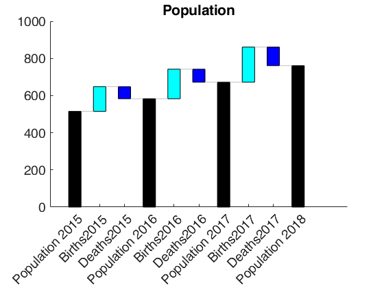
  • waterfall called with h ouptut.
  • X=[515 133 -65 583 159 -70 672 189 -100 761]';
    rownam={'Population 2015' 'Births2015' 'Deaths2015' ...
    'Population 2016' 'Births2016' 'Deaths2016' ...
    'Population 2017' 'Births2017' 'Deaths2017' ...
    'Population 2018'};
    sel=[1 4 7 10];
    Xtable=array2table(X,'RowNames',rownam','VariableNames',{'Population'});
    h=waterfallchart(Xtable,'SetAsTotal',sel);
    % Change the colors of the patches  which are set as total
    h(1).FaceColor='k';
    % Change the colors of the patches  which have positive values
    h(2).FaceColor='c';
    % Change the colors of the patches  which have negative values
    h(3).FaceColor='b';
    Click here for the graphical output of this example (link to Ro.S.A. website)

  • waterfall chart with option DisplayValueOnTopOfPatches.
  • X=[245631 -2412 243219 -114899 -18731 -6244 103345 -26745 ...
    -11279 -36000 29321 -4400 24921];
    waterfallchart(X,'DisplayValueOnTopOfPatches',true);

  • waterfall chart with option SetAsTotal passed as logical.
  • X=[245631 -2412 243219 -114899 -18731 -6244 103345 -26745 ...
    -11279 -36000 29321 -4400 24921];
    SetAsTotal=[true false true false false false true false false false true false true];
    Labels={'Gross revenues' 'Ordinary expenses' ... 
    'Net revenues' 'Initial inventories' 'Merchandising', 'Other selling costs', ...
    'Gross Income' 'Wages' 'Marketing advertising' 'Insurance bank charges' ...
    'Operating income' 'Taxes' 'Net income'};
    waterfallchart(X,'SetAsTotal',SetAsTotal,'Labels',Labels);

    Input Arguments

    expand all

    Y — Input data. Vector of table with one column.

    Data matrix containing n observations

    Data Types: double

    Name-Value Pair Arguments

    Specify optional comma-separated pairs of Name,Value arguments. Name is the argument name and Value is the corresponding value. Name must appear inside single quotes (' '). You can specify several name and value pair arguments in any order as Name1,Value1,...,NameN,ValueN.

    Example: 'SetAsTotal',[2,3] | logical([0 1 1 0 0 0]) , 'barwidth',0.7 , 'titl',{'demographic movements'} , 'labels',{'aa' 'bb' 'cc' ddf'} , 'DisplayValueOnTopOfPatches',true , 'ShowConnectorLines',false

    SetAsTotal —elements which have to be set as total.logical | numeric index vector.

    Logical or numeric index vector indicating which elements of Y have to be set as total.

    Example: 'SetAsTotal',[2,3] | logical([0 1 1 0 0 0])

    Data Types: double | logical

    BarWidth —width of the bars.scalar.

    A number in the interval 0 1 which specifies the width of the bars. The deafult value is 0.6.

    For example if bardwidth is 0.5, than the first bar has coordinated 0.75 1.25 the second 1.75 2.25 ...

    Example: 'barwidth',0.7

    Data Types: double

    titl —plot title.character | cell.

    string containing plot title If Y is a table, the variableName of the table is used as title

    Example: 'titl',{'demographic movements'}

    Data Types: cell

    Labels —x labels.cell.

    cell of length n containing the labels for the n elements to add to the xTickLabels of the plot.

    If Y is a table, the rowsnames of the table are used as labels. The default is to use the labels 1, 2, ..., n

    Example: 'labels',{'aa' 'bb' 'cc' ddf'}

    Data Types: cell

    DisplayValueOnTopOfPatches —display values on top of patches.boolean.

    If this option is set to true, than the Y values are displayed on top of the patches. The default is false, that is values on top of the patches are not shown.

    Example: 'DisplayValueOnTopOfPatches',true

    Data Types: boolean

    ShowConnectorLines —Show connector lines.boolean.

    If this option is set to true (default), connector lines are shown in the plots to connect the patches.

    Example: 'ShowConnectorLines',false

    Data Types: boolean

    Output Arguments

    expand all

    h —handles to the patches. Vector of graphic handles

    3-by-1 vector of graphic handles.

    h(1) is the handle to the patches which are SetAsTotal.

    h(2) is the handle to the patches which have positive values.

    h(3) is the handle to the patches which have positive values.

    References

    See Also

    This page has been automatically generated by our routine publishFS