waterfallchart
waterfallchart creates a waterfall chart
Description
A waterfall chart is a form of data visualization that helps in understanding the cumulative effect of sequentially introduced positive or negative values. These intermediate values can either be time based or category based. The waterfall chart is also known as a flying bricks chart or Mario chart due to the apparent suspension of columns (bricks) in mid-air. Often in finance, it will be referred to as a bridge.
Waterfall chart. For more details see https://en.wikipedia.org/wiki/Waterfall_chart
waterfall chart with options SetAsTotal and Labels.h
=waterfallchart(Y,
Name, Value)
Examples
 waterfall chart with options SetAsTotal and Labels.
waterfall chart with options SetAsTotal and Labels.
X=[245631 -2412 243219 -114899 -18731 -6244 103345 -26745 ...
-11279 -36000 29321 -4400 24921];
% Define the elements of X which contain the
SetAsTotal=[1 3 7 11 13];
Labels={'Gross revenues' 'Ordinary expenses' ...
'Net revenues' 'Initial inventories' 'Merchandising', 'Other selling costs', ...
'Gross Income' 'Wages' 'Marketing advertising' 'Insurance bank charges' ...
'Operating income' 'Taxes' 'Net income'};
waterfallchart(X,'SetAsTotal',SetAsTotal,'Labels',Labels);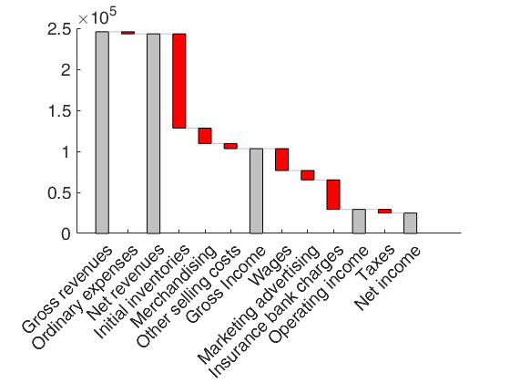
Related Examples
waterfall chart with input as a table.
waterfall chart with input as a table.
figure
X=[515 133 -65 583 159 -70 672 189 -100 761]';
rownam={'Population 2015' 'Births2015' 'Deaths2015' ...
'Population 2016' 'Births2016' 'Deaths2016' ...
'Population 2017' 'Births2017' 'Deaths2017' ...
'Population 2018'};
sel=[1 4 7 10];
Xtable=array2table(X,'RowNames',rownam','VariableNames',{'Detailed Analysis of the population growth'});
waterfallchart(Xtable,'SetAsTotal',sel);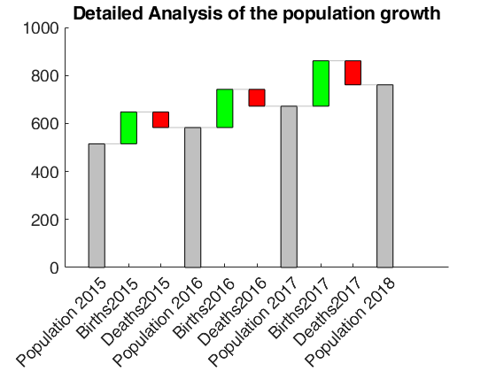
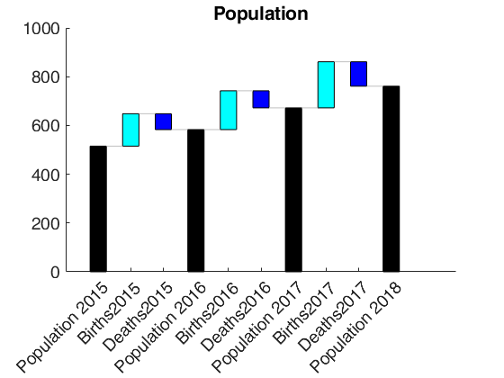
waterfall called with h ouptut.
waterfall called with h ouptut.
X=[515 133 -65 583 159 -70 672 189 -100 761]';
rownam={'Population 2015' 'Births2015' 'Deaths2015' ...
'Population 2016' 'Births2016' 'Deaths2016' ...
'Population 2017' 'Births2017' 'Deaths2017' ...
'Population 2018'};
sel=[1 4 7 10];
Xtable=array2table(X,'RowNames',rownam','VariableNames',{'Population'});
h=waterfallchart(Xtable,'SetAsTotal',sel);
% Change the colors of the patches  which are set as total
h(1).FaceColor='k';
% Change the colors of the patches  which have positive values
h(2).FaceColor='c';
% Change the colors of the patches  which have negative values
h(3).FaceColor='b';